About the Project
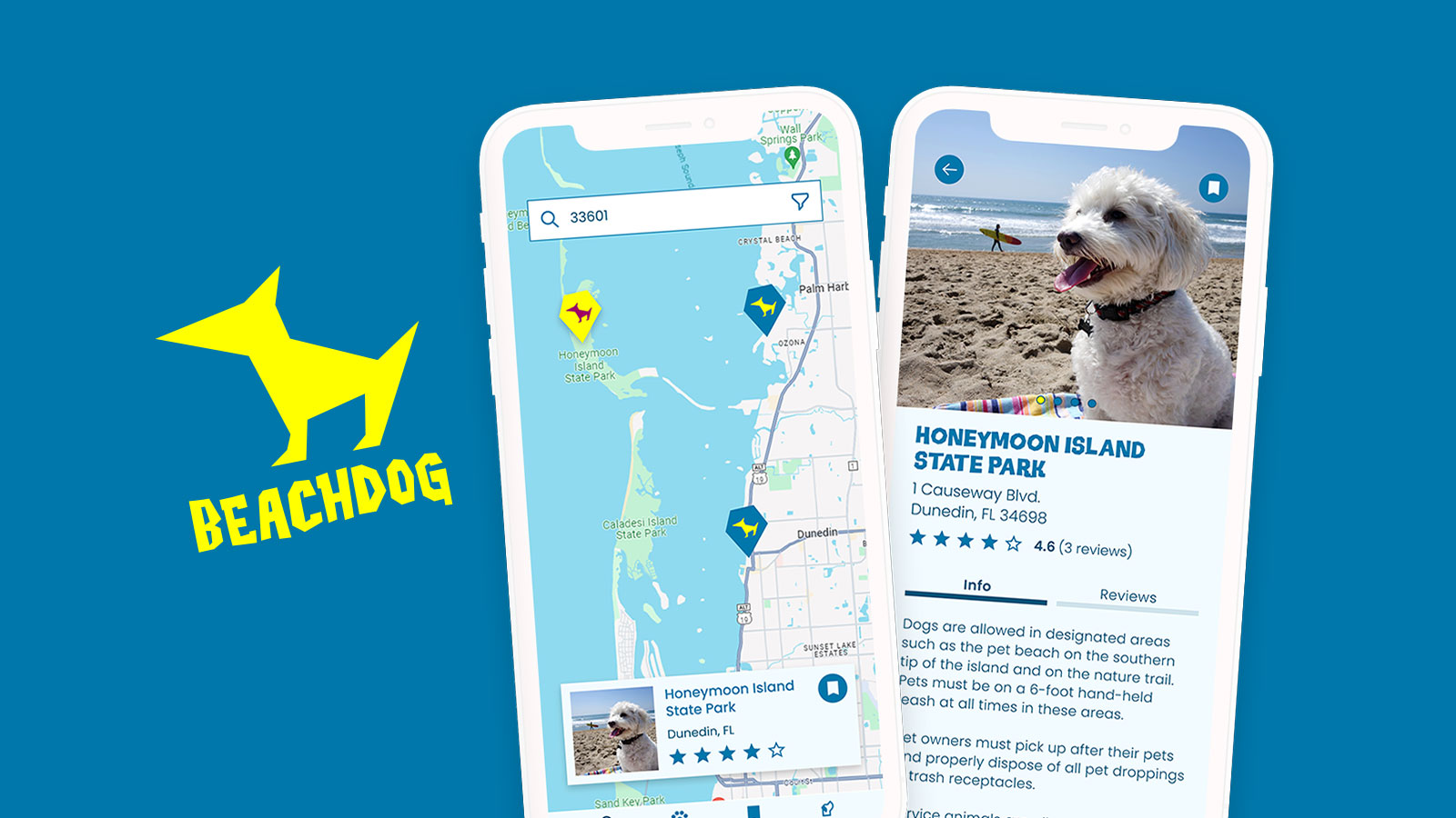
For my final project for the Google UX Design certification, I wanted to design a mobile app that makes it easy to locate dog-friendly beaches and include important info on rules, restrictions and amenities.
This is an underserved category for dog lovers. Info on which beaches are dog friendly is not always easily ascertained by consulting Google Maps or Yelp. The info in those apps is not always precise or up-to-date. Sometimes you just gotta show up to the beach and hope for the best. I often see reviewers mention that they wish for an app specifically for dog-friendly beaches. An app that consolidates all this info and makes it accessible within a few clicks would be much appreciated by beach-loving dogs and their humans!
My Role
Lead UX/UI Designer
My Responsibilities
- ideation
- competitive audit
- user research
- information architecture
- low fidelity prototyping
- high fidelity prototyping
Understanding the User
I know what I’m looking for in a dog-beach app, but I wanted to survey others in my area to see if there are any features I hadn’t thought of that would be useful for local beachgoers. I headed to a nearby Tampa Bay beach (with my dog, Max, of course!) and spoke with several people about what features they’d like to see.
Demographics
Based on my observations and conducting some online research, I discovered that the typical dog beachgoer is aged 30-50, with a mix of individuals, families and retirees. Most are college educated and tend to be working professionals. Dog owners in Tampa Bay tend to live an active lifestyle and spend a lot of time outdoors, which makes sense given the warm climate.
After speaking with other dog-beach frequenters, I made a list of the key features my target audience was looking for in a dog beach app.
- detailed beach information (amenities, parking availability, rules and regulations)
- user reviews and ratings
- interactive map and directions
- ability to connect with other dog owners to organize meetups
- ability to save favorite beaches, receive recommendations and set preferences
- info on nearby dog-friendly businesses
- photo sharing
- accessibility information for people with disabilities
My goal was to create a minimum viable product with a small set of features so I could launch quickly and validate the concept with real users. For the initial launch, I chose to focus on the bolded items listed above. Those features should be enough to make the app usable, and other requested features could be added later.
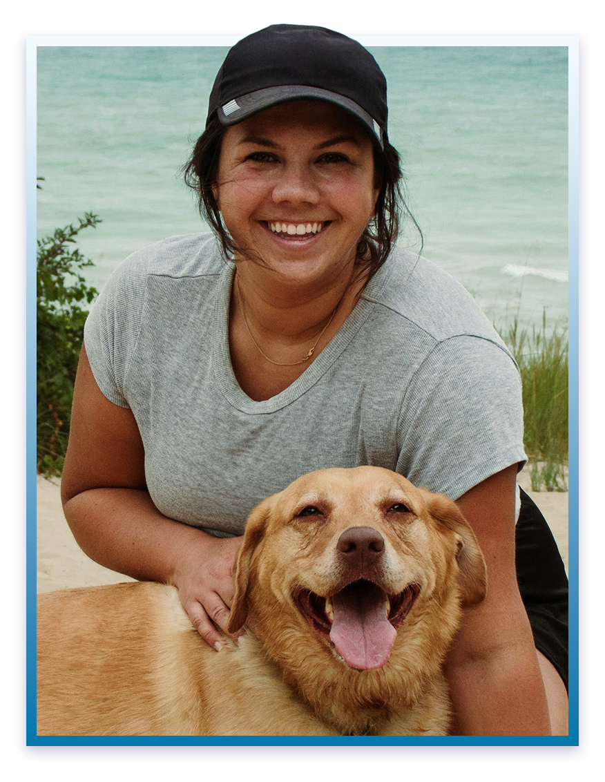
“Taking my dogs to the beach is one of my favorite things to do, but I need to know that the beach is clean, safe and allows dogs before I go. I wish there was an easy way to get all that info in one place.”
Persona: Cynthia Jordan
Cynthia is a marketing professional living in Tampa. She’s originally from the northeast but moved to Florida several years ago for the weather and beaches. Cynthia and her husband are both dog lovers, and they enjoy taking their dogs to the beach. Due to the high cost of living in Tampa Bay, she’s budget conscious and prefers free or low-cost activities. As a busy professional, Cynthia has limited time to plan activities. She values quick and easily accessible information to make good decisions about how to spend her valuable weekend time.
Age: 35
Gender: Female
Education: bachelors degree
Hometown: Tampa, FL
Family: married with two dogs, a Labrador Retriever and a Cocker Spaniel
Occupation: marketing manager
Goals
- find new dog-friendly beaches
- stay informed about beach conditions
- plan day trips
- connect with other dog owners
Frustrations
- high cost of living
- limited free time
- difficulty finding reliable info about dog-friendly beaches
- lack of community for dog owners
User Journey Map
Persona: Cynthia Jordan
Goals: Find a dog-friendly beach, navigate to the beach and leave a review.
| Action | Task List | Feeling | Improvement Opportunities |
|---|---|---|---|
| Find a dog beach to visit |
|
pleased, excited | Make it easy to search based on preferences. |
| Plan the visit |
|
ready, confident | Provide detailed info on what to expect at the beach.
Make it easy to save specific beaches to a custom list. |
| Arrive at selected beach |
|
excited, optimistic | Provide a seamless transition from BeachDog app to navigation app. |
| Leave a review |
|
satisfied, engaged, helpful | Make it easy to find recently visited beaches. Provide an intuitive process for leaving a review. |
Competitive Audit
I couldn’t find any apps that specifically cater to dog beaches, but I found a couple apps that focus on finding dog-friendly businesses. I broadened my scope to include navigation and location-based services apps that provide user reviews. I figured I could follow this format and customize the experience for beachgoing dogs. Google Maps, Yelp and AllTrails closely matched the services I wanted to provide in my app. I could follow their user flows as a solid foundation and adjust them to suit my target audience’s needs.
Direct Competitors
BringFido
BringFido is a prominent app for finding dog-friendly places, but the user experience could be more intuitive. The app contains an option to search for dog beaches, but it’s buried underneath the Activities filter. The beach info provided could be more robust. The user-generated content is somewhat sparse. The interface could use a refresh.
DogPack
DogPack provides similar content to BringFido but focuses more on the social connection aspect. The user experience is somewhat clunky. I encountered several bugs while trying to use the app. The personal info you’re required to provide seems like an invasion of privacy.
Indirect Competitors
Google Maps
Google Maps is great for general navigation and discovering new places, but the content isn’t tailored to dog beach lovers. However, I can reference this app when designing BeachDog’s interactive map, search results and user reviews.
Yelp
Similar to Google Maps, Yelp provides a broad, general search and discovery experience for all types of businesses. Yelp’s user-friendly interface will be a valuable resource for constructing the flow of user generated content.
AllTrails
AllTrails is much more niche than Google Maps and Yelp. The app’s content and target audience differ from BeachDog, but AllTrails offers similar features. The user flow and interface will help inform the design of BeachDog.
Low Fidelity Mobile Prototype
Before this project, I had never fully designed an app from the ground up. I wasn’t sure where to begin on creating user flows and wireframes. So I took screenshots of the primary flow of Yelp and AllTrails and laid them out in Figma.
I then began to create my low fidelity prototype next to the screenshots. I included useful features from those apps while eliminating features that weren’t necessary for my app.
Initially, my primary flow consisted of a search function, a beach listing with relevant info, and user reviews.
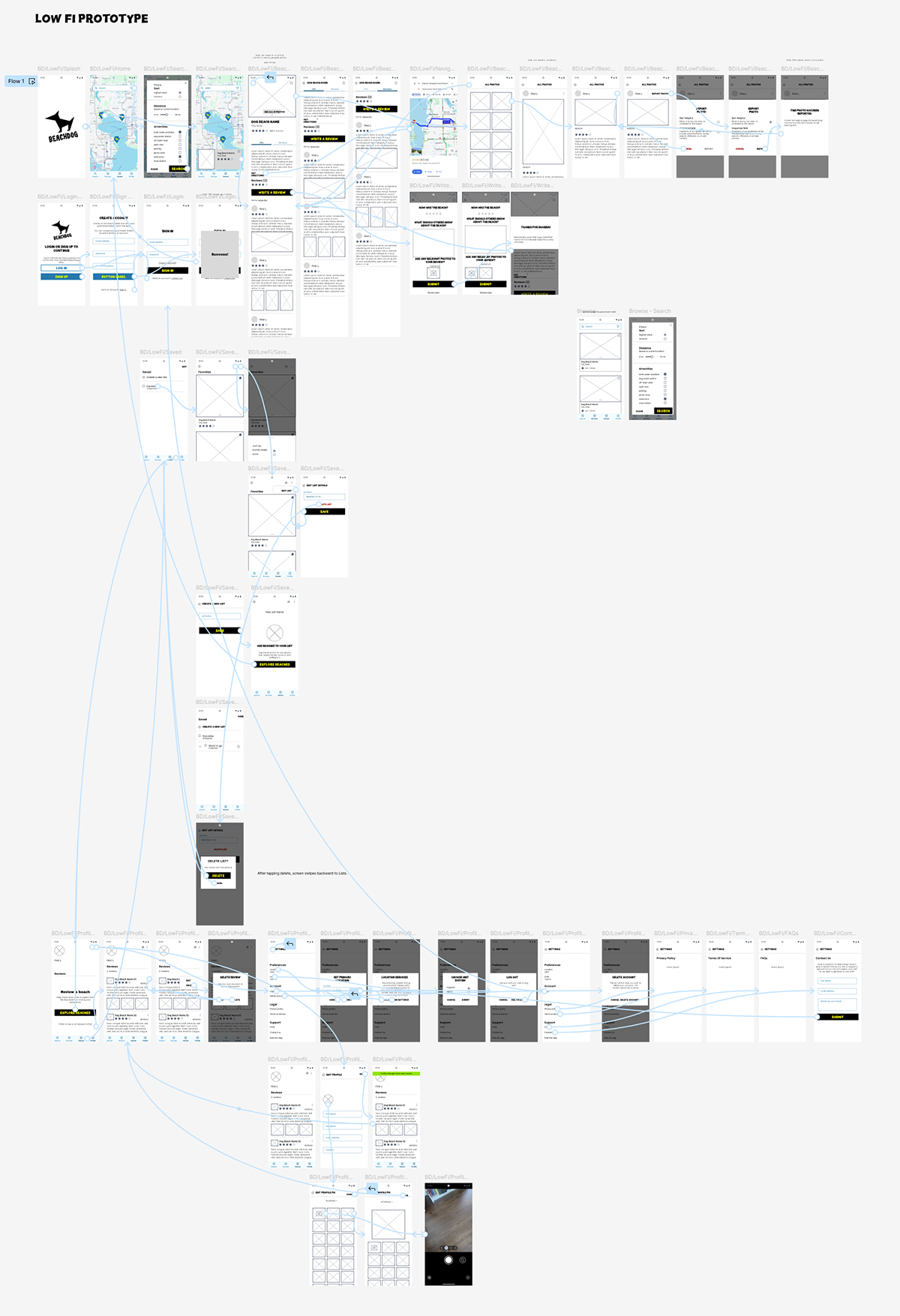
Low Fidelity Prototype
Once I solidified my primary flow, I realized I would need to include the ability to create a profile as well as a login flow so users can leave reviews and save their favorite beaches. I also realized users would need the ability to adjust settings such as saving their preferred location and measurement system for calculating distance. Users would also need the option to edit or delete their reviews.
Test out the low fidelity prototype below!
After I completed these flows, I tested the low-fi prototype with several dog-beach goers and collected their feedback. They helped me discover that I had missed a step or two here and there to successfully complete some of the flows. One person pointed out that I needed to create a forgot password flow. Some testers mentioned that they would like a section to scroll through random beach listings without first having to input any data.
Style Guide
At this point, I took a break from developing the prototype to work on the branding and style guide. I wanted BeachDog to have a serene, beachy feel while integrating a hint of the funky 90s surf vibe. I adjusted the color contrast between the text and backgrounds to ensure all colors are WCAG AAA compliant.
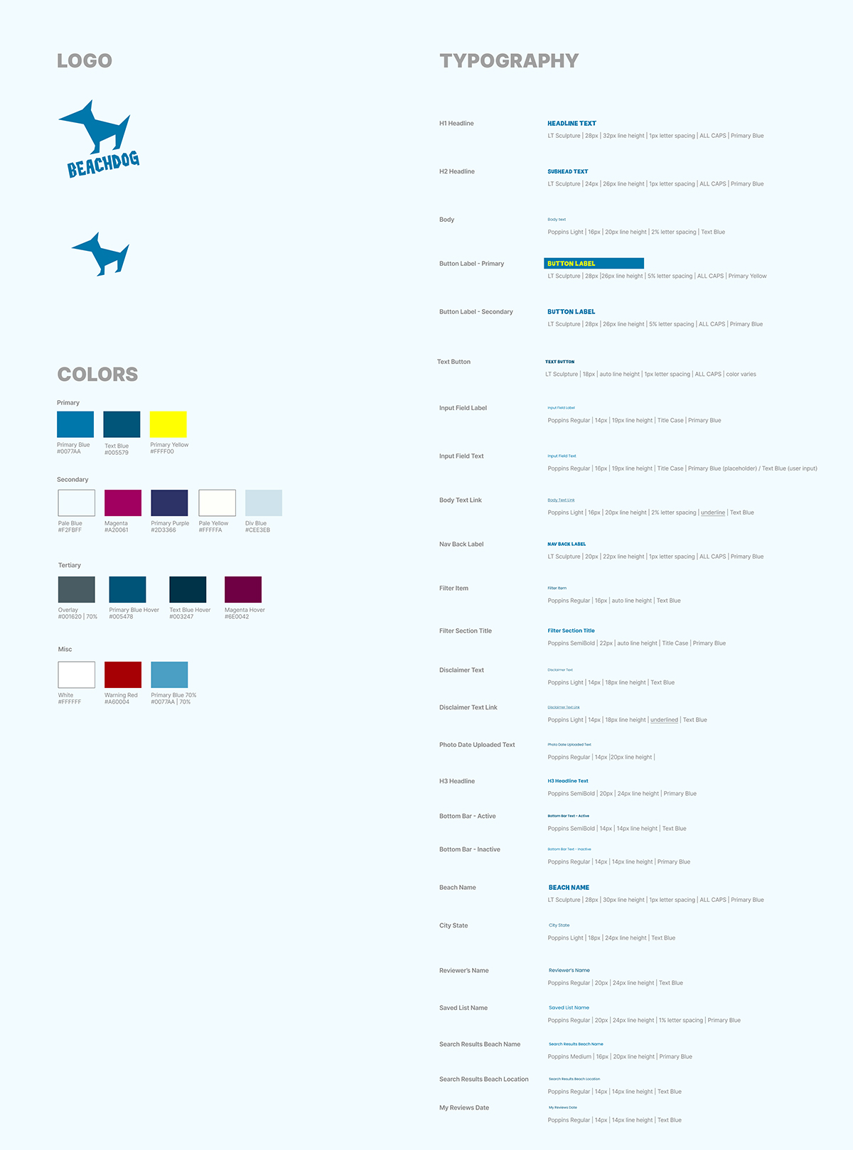
BeachDog’s Style Guide
After completing the style guide, I began applying it to my high fidelity prototype while incorporating the feedback I received during user testing. I created reusable components and text styles to speed up the design process.
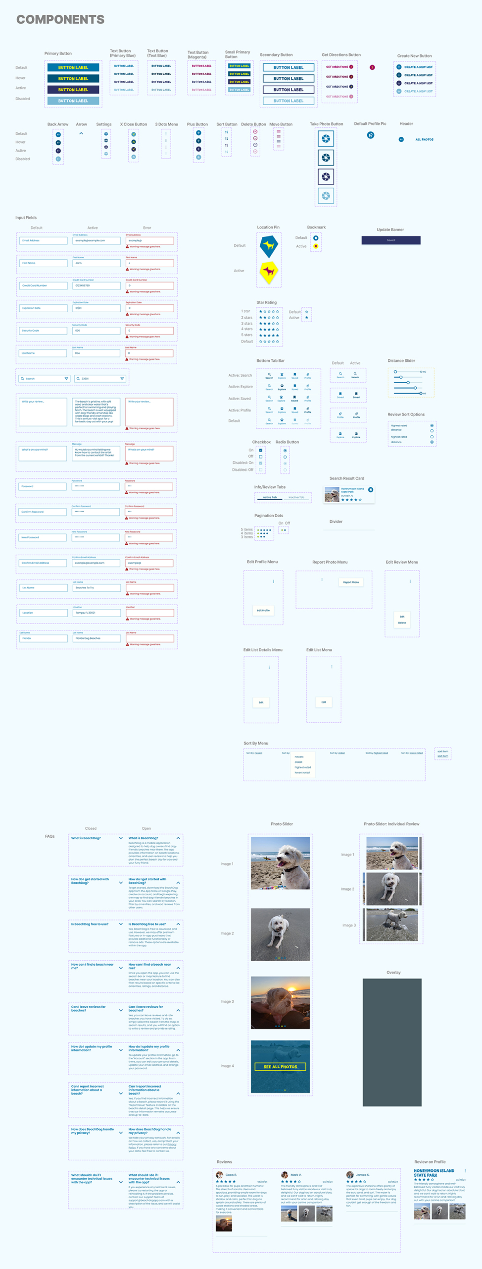
BeachDog’s Component Sheet
Information Architecture
Once I had a better understanding of how a user flow works in an app, I took a step back to create a sitemap. I wanted to make sure I was accounting for all necessary paths and pages.
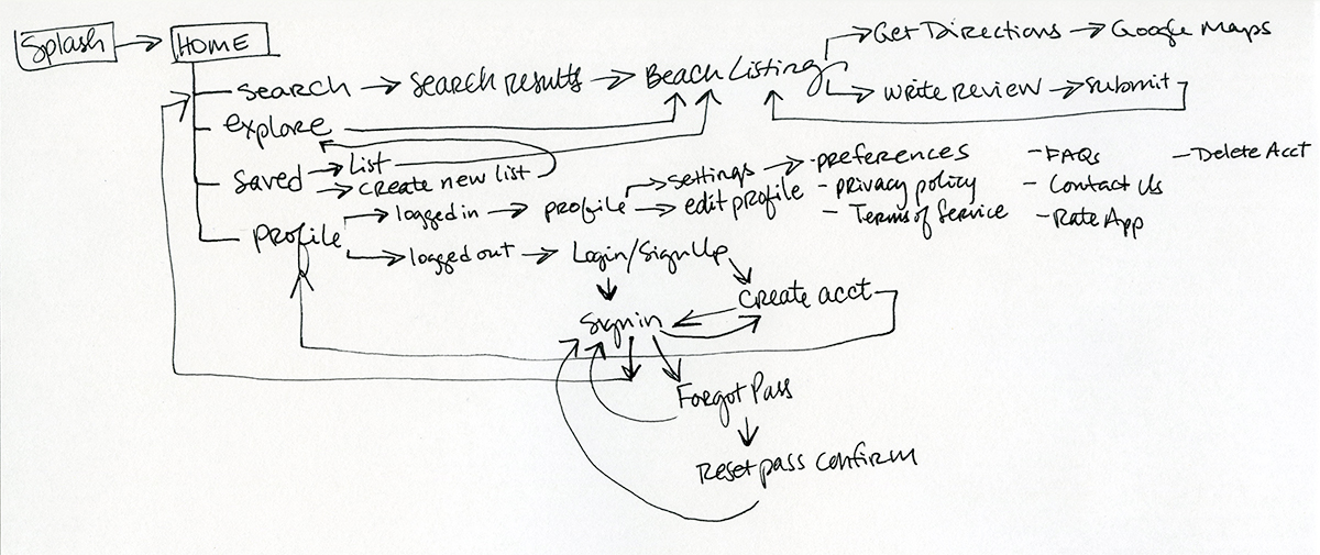
Sitemap
High Fidelity Prototype
While designing the high-fidelity prototype, I focused on ensuring the design is user centric so that the experience of finding a dog-friendly beach is enjoyable and efficient. The intuitive interface allows users to quickly locate nearby dog-friendly beaches and access detailed beach information and user reviews. The review process is simple and easy to follow to increase user engagement. Special attention was given to ensure a seamless navigation experience with visually appealing design elements that align with the BeachDog brand.
After completing the high-fi prototype, I again asked several beachgoers to test the app and provide feedback. I used their feedback to confirm the final prototype is functional and a delight to use.
In a real life scenario, at this point I would meet with the development team to review the prototype, style guide and component sheet and answer any questions. After the first round of development, I would QA the app and provide feedback to the dev team.
Try out the high fidelity prototype below!
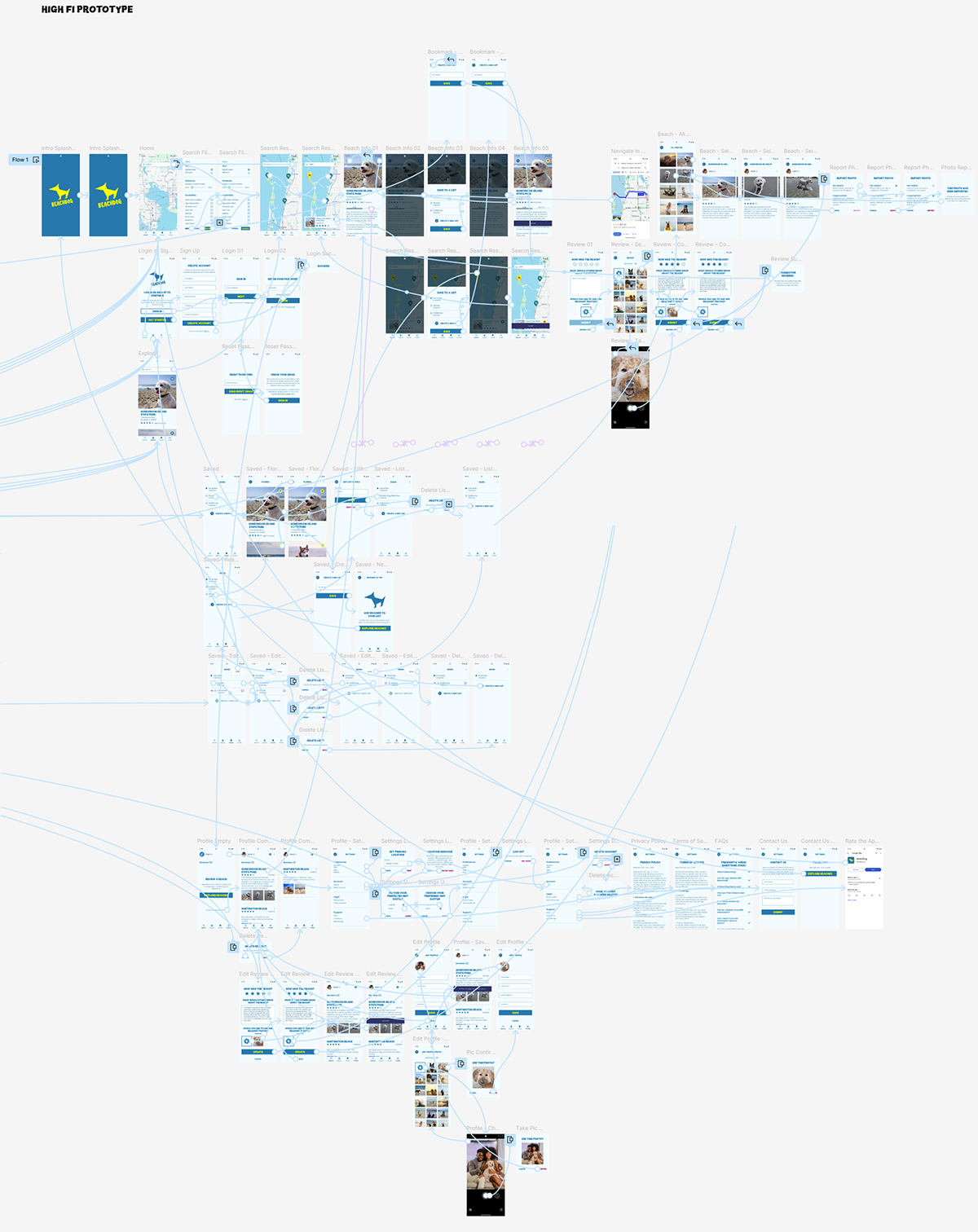
High Fidelity Prototype
Final Thoughts
Completing the high-fidelity prototype for BeachDog marks a significant milestone in the app’s development. The entire process was deeply rooted in user-centered design principles to ensure every feature and interaction is tailored to the specific needs of the app’s target audience.
If the app were real and had an initial product launch, afterward I would conduct user surveys to gather feedback on which features resonate most with users, identify areas for improvement, and explore any additional features they’d like to see. This continuous feedback loop is critical to refining the BeachDog app and guaranteeing it remains a valuable tool for dog-beach lovers.
This project has not only reinforced my commitment to user-centric design but has also provided valuable insights into the importance of ongoing user testing and iteration to create a successful product.

